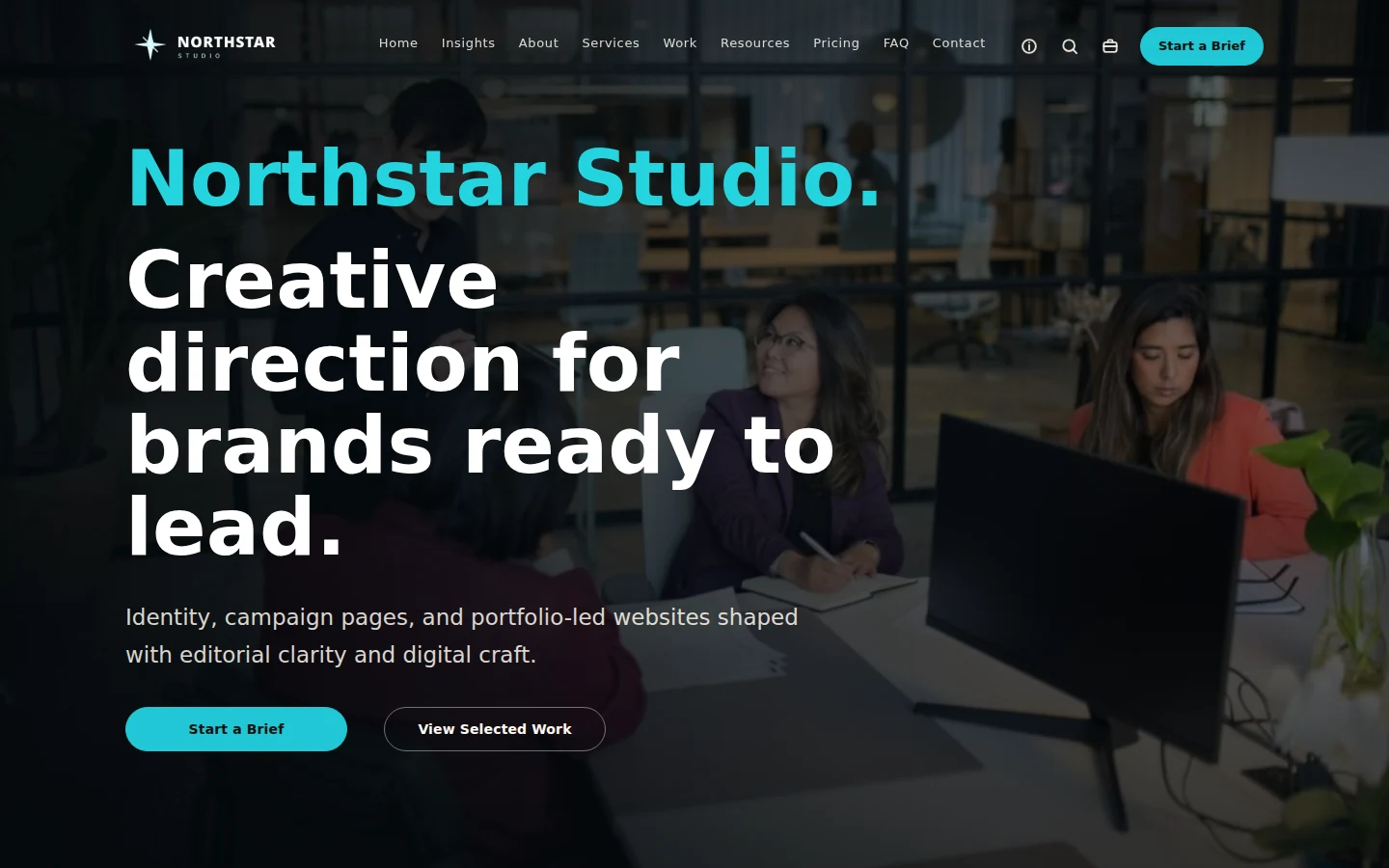
Business portfolio
Northstar Studio
A confident editorial system for creative teams, consultants, and service firms.
Open demoExplore the current Canvza showroom: six distinct starting points for building a credible WordPress site visually, then making the system your own.
Each route is a live Canvza-built presentation. Open a system to explore its complete homepage and inner-page rhythm.
Different industries, different visual languages, one visual WordPress workflow underneath.
A confident editorial system for creative teams, consultants, and service firms.
Open demo
A clear trust and conversion path for local teams that need the next request to feel easy.
Open demo
A focused product system for explaining complex workflows with clarity and momentum.
Open demo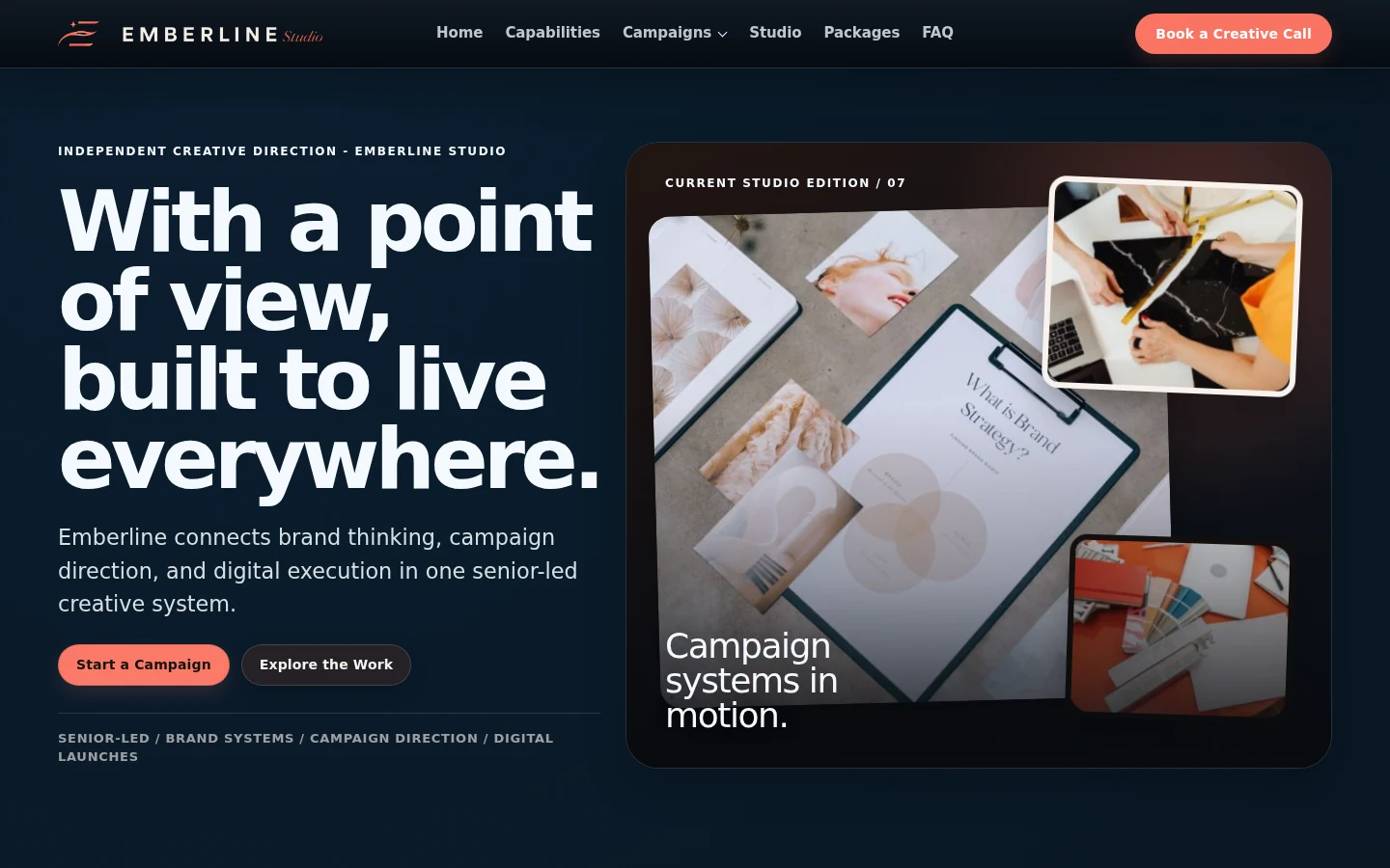
An atmospheric editorial system for campaigns, capabilities, and work worth lingering on.
Open demo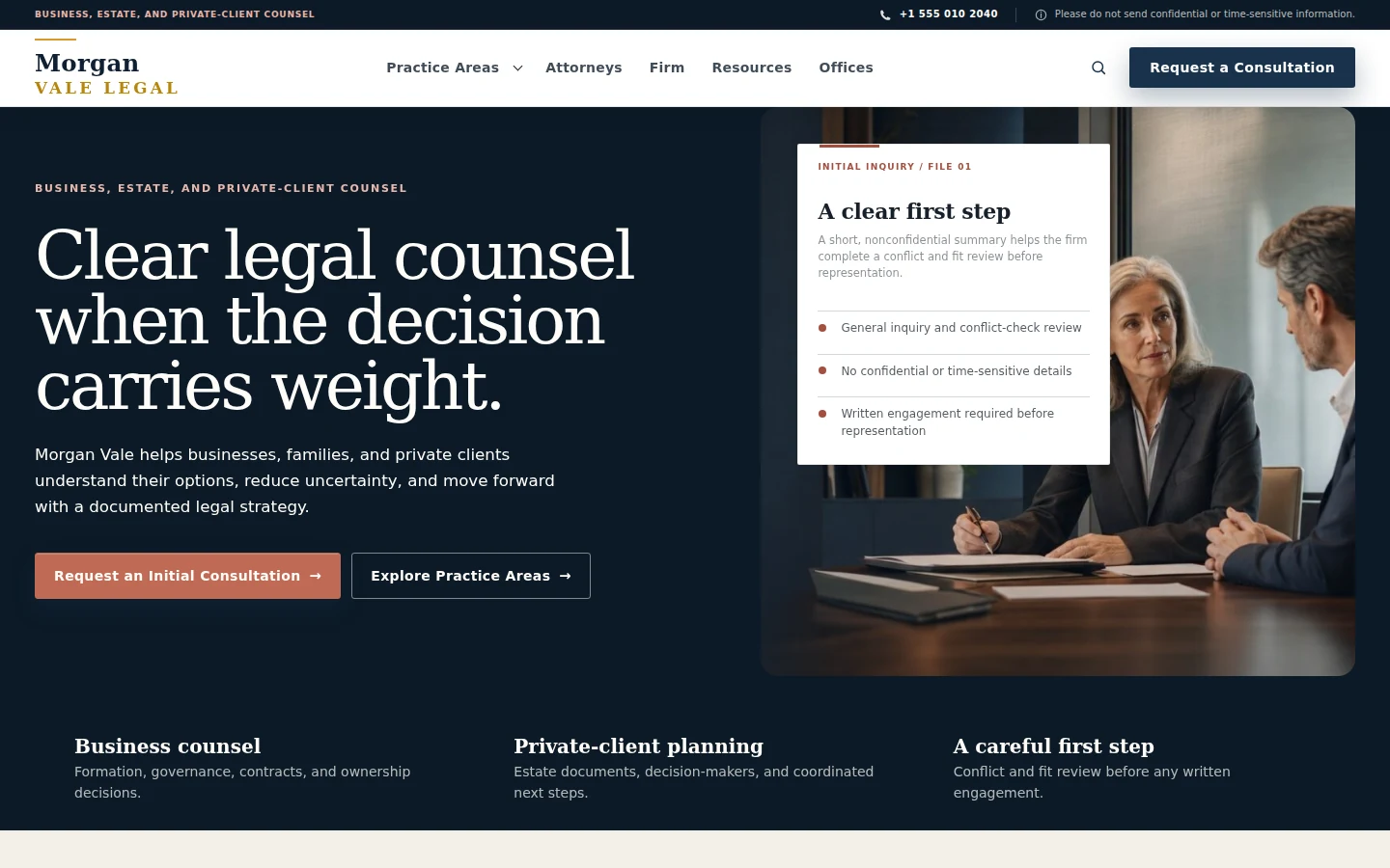
A measured framework for expertise, practice areas, and credible client action.
Open demo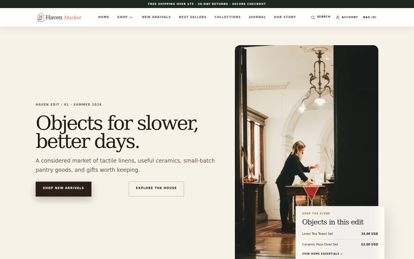
A Canvza + Siphonr demonstration showing the visual storefront and commerce layer together.
Open demoHaven is the demonstration storefront: Canvza shapes the experience and Siphonr runs commerce on the site. It is not Fixstable’s checkout or account shell.
Open Haven Market